11 reasons why responsive website design is the best option.
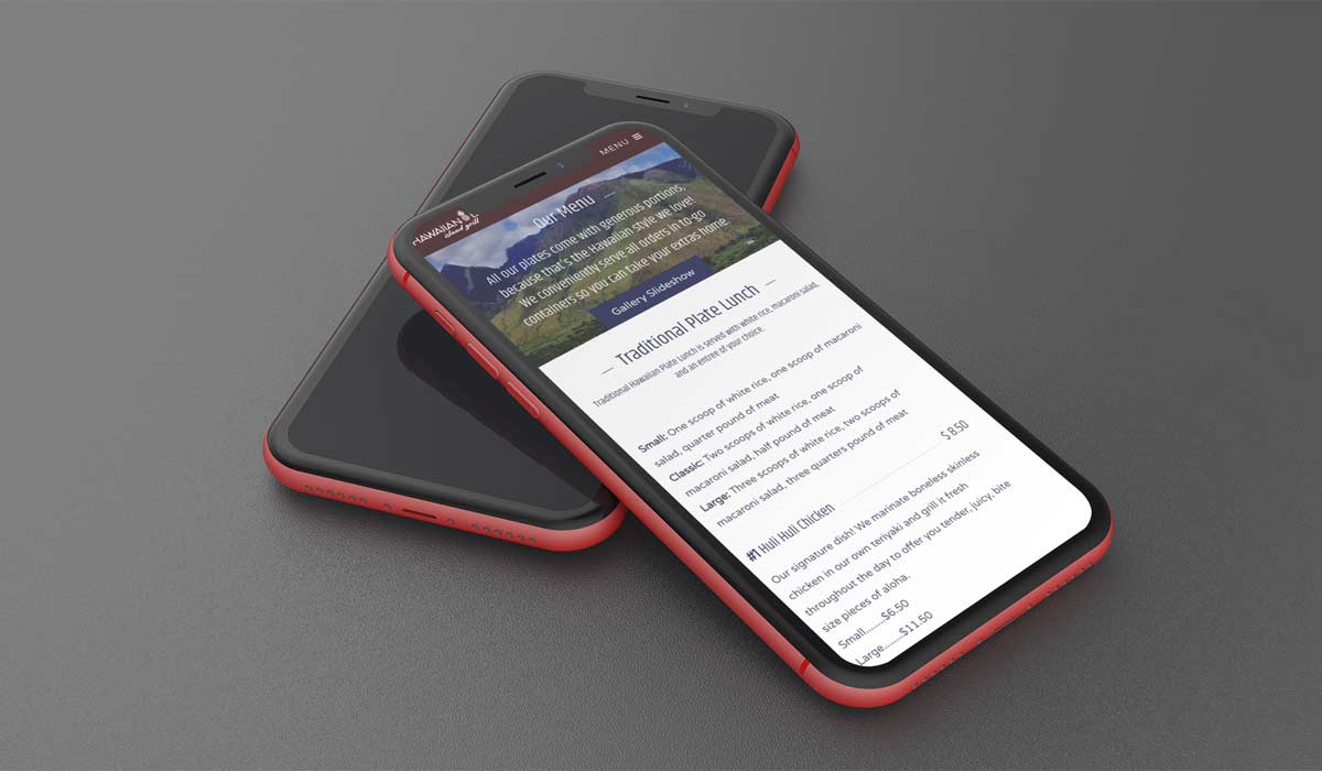
The best aspect of implementing a responsive web design is that it provides site visitors with an improved user experience. If your website scales and responds to the change in screen size, then visitors will be accessing menus, links, buttons, or filling out forms with ease. As a result, their user experience will be better and they'll spend more time on your site. If visitors must do a lot of zooming, shrinking, and pinching their screens during their first visit, they're likely to give up and try another website. The ultimate goal of responsive design is to avoid the unnecessary resizing, scrolling, zooming, or panning that occurs with sites that have not been optimized for different devices.
Over half of all global web traffic originates from mobile devices. If you don’t cater to this audience, you’ll be missing out on more than half of your potential audience. Therefore, it's increasingly important for companies to have websites that render properly on smaller screens. To improve their search results for mobile users, Google favors responsive websites so they appear higher on the search engine results.
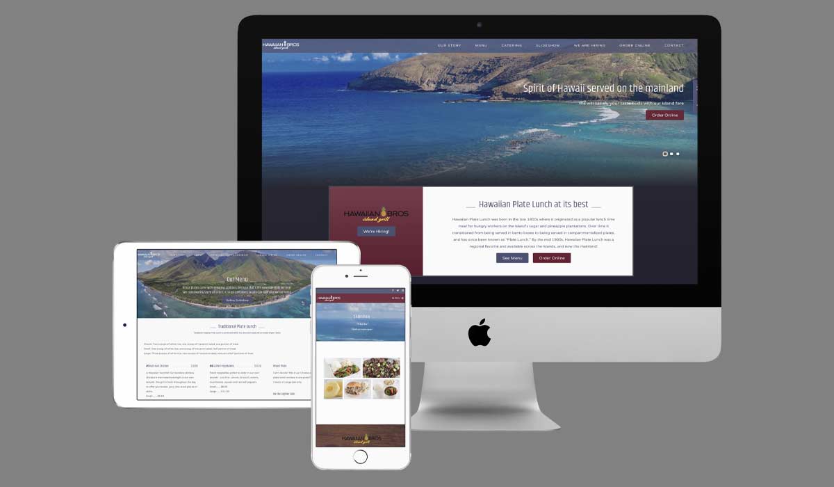
Having a better website design because of responsive implementation will increase mobile usage, which ensures that you have access to a whole new subset of customers. Your audience will access your website from a variety of different devices in all shapes and sizes. Responsive design will accommodate them no matter how big or small their screen is.
You will invariably have lower maintenance needs for your website by foregoing the development of a secondary website. Responsive website design replaces the previous need to design a dedicated mobile website for smartphone users. It requires less time to develop one website than to engineer multiple websites for different devices. Having a separate desktop and mobile sites means your digital marketing team will need to create two content strategies, build two administrative interfaces and potentially bring in two design teams.
When you have a website with a responsive design, you can make changes quickly and easily. With a responsive website, it means you only have to make the change once. This flexibility is a huge advantage. Maintaining a separate mobile site requires additional testing and support. It takes less time to update one responsive website so you will save on maintenance costs. Responsive design allows you to make changes quickly and easily.
When it comes to website updates and maintenance the odds are more likely for you to make more mistakes when you have two or more websites to update. Having one unique URL reduces the possibility of mistakes in grammar, coding, content updates, etc.
Responsive websites tend to load faster on all devices, but especially on smartphones and tablets. Sites that aren’t optimized to work with tablets and smartphones will take longer to load. Thanks to responsive images and fluid grids, it takes significantly less time for a page to load, which has a direct impact on the duration of your user’s visit. If a site isn't optimized for smartphones and tablets, it will also take more time to navigate, which can frustrate customers to a point of no return. No redirection is needed based on the device, therefore reducing load time. A faster load time improves search engine ranking and the user experience.
A responsive website that’s optimized for mobile devices will provide the user with a better experience from the moment they enter the website. Your potential customers aren’t going to put up with a slow, difficult to use the website. If your website isn’t compatible with the device they are using then they will simply back up and go to one of your competitors. This type of design increases the functionality and performance of a website, which will cause visitors to stay on your website longer.
If you have duplicate versions of websites for different devices that means you would need to look at the analytics and data of each version of the website. Using a responsive web design with your website allows for very simplistic website analytics, which will allow you to more easily learn about where site traffic is coming from.
Responsive design can help with SEO because Google gives preference to mobile-friendly websites. Having one unique URL for your website, regardless of the device it is being used on, helps Google's algorithm to index your web page. Another one of the advantages of responsive web design is improved search engine ranking. Your site will automatically be lowered on search results if Google or other search engines don’t detect a responsive design.
Being able to rank higher on search engine results will allow you to bring in many more site visitors, which will increase customer conversion rates. A responsive website is the best option for your web design needs as it delivers the best user experience. Longer site visits equate to higher sales and better conversion rates.
If your website isn't yet responsive, planning a redesign and a new, fluid layout is a great first step. Using a responsive design for your website is among the most advantageous things that you can do for your business. If you’re interested in maximizing your SEO efforts or developing your website from the ground up with a responsive, optimized, custom web design, contact us today!